前言
iPhoneX 取消了物理按键,改成底部小黑条,这一改动导致网页出现了比较尴尬的屏幕适配问题。对于网页而言,顶部(刘海部位)的适配问题浏览器已经做了处理,所以我们只需要关注底部与小黑条的适配问题即可(即常见的吸底导航、返回顶部等各种相对底部 fixed 定位的元素)。
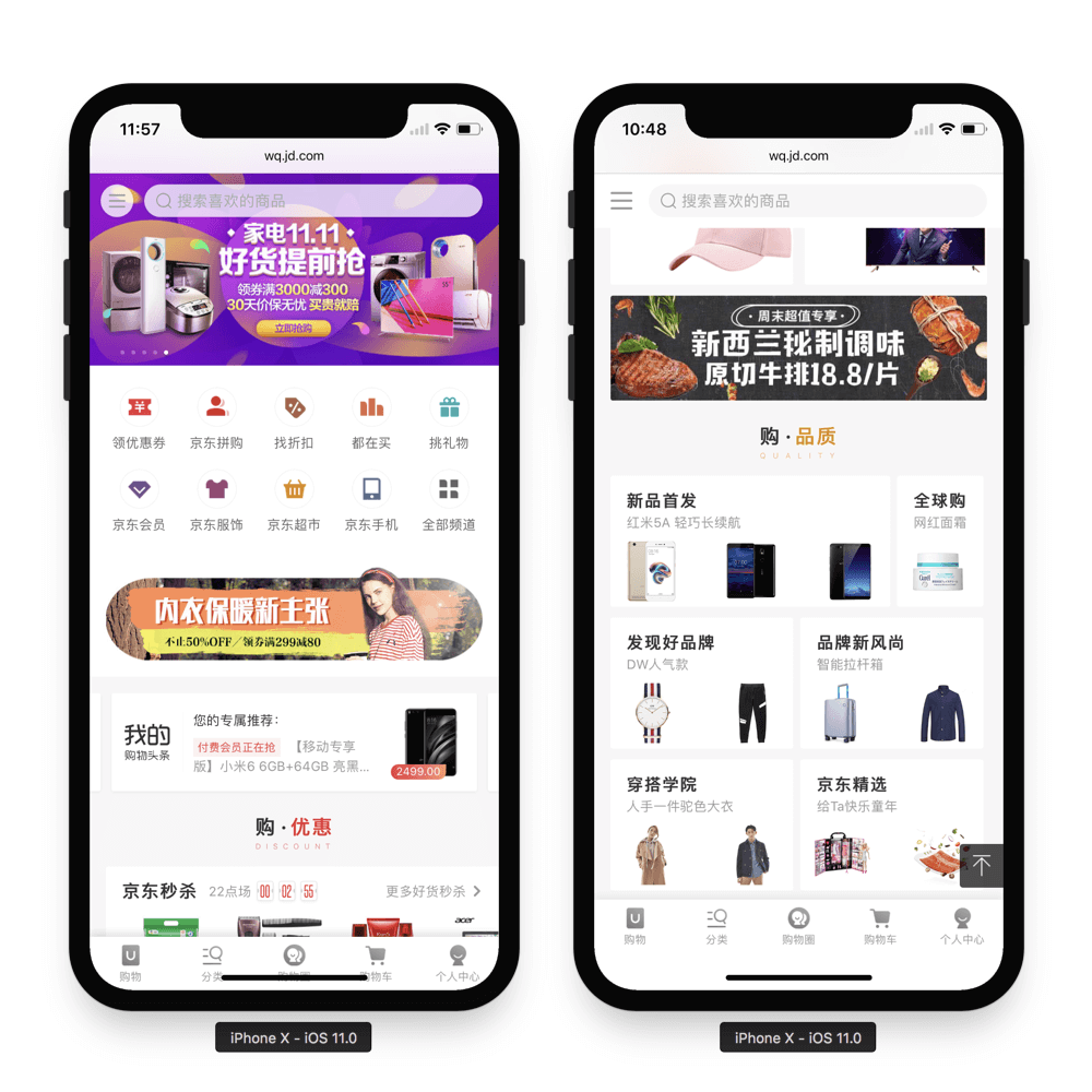
笔者通过查阅了一些官方文档,以及结合实际项目中的一些处理经验,整理了一套简单的适配方案分享给大家,希望对大家有所帮助,以下是处理前后效果图:
适配之前需要了解的几个新知识
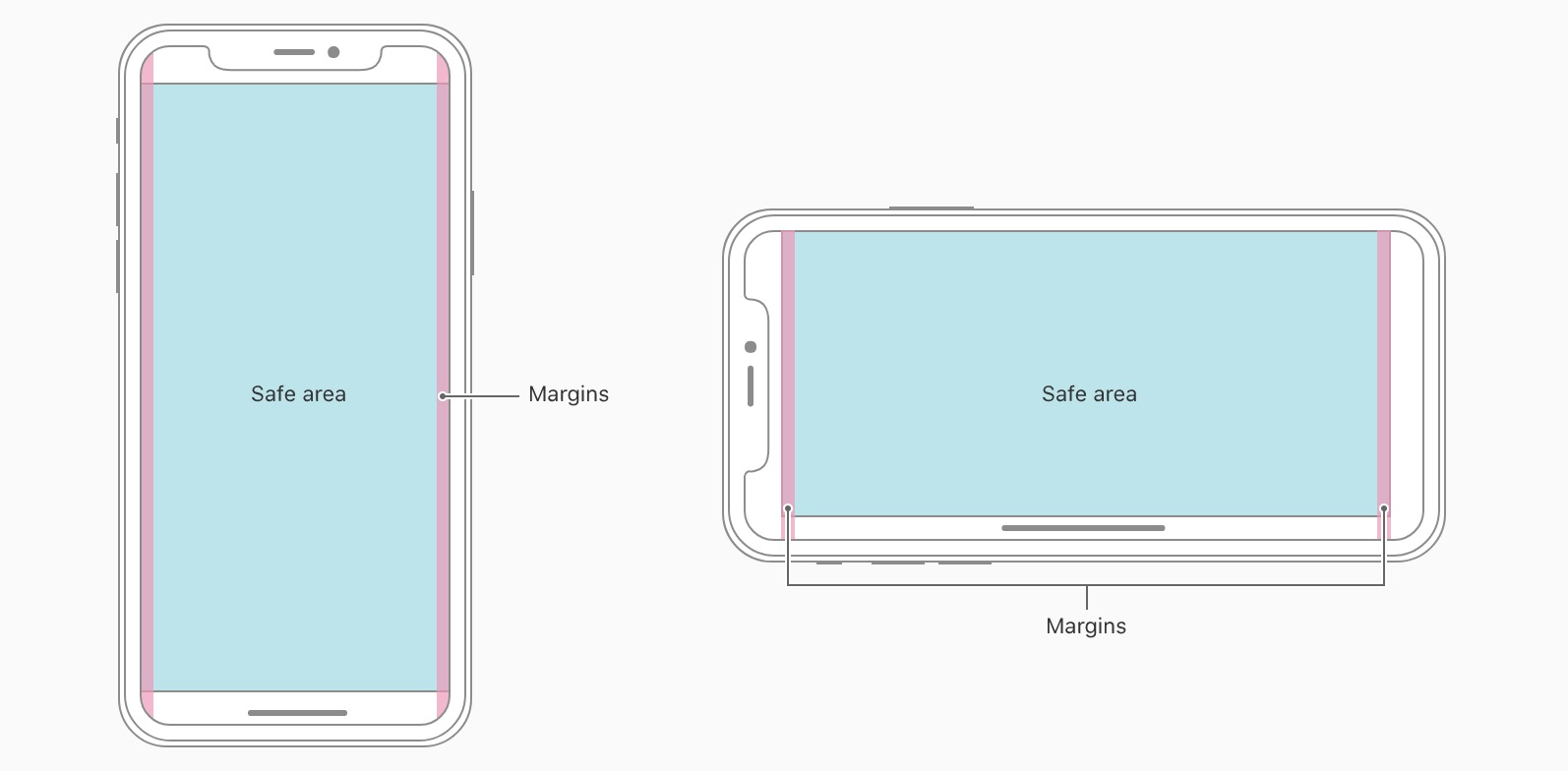
安全区域
安全区域指的是一个可视窗口范围,处于安全区域的内容不受圆角(corners)、齐刘海(sensor housing)、小黑条(Home Indicator)影响,如下图蓝色区域:
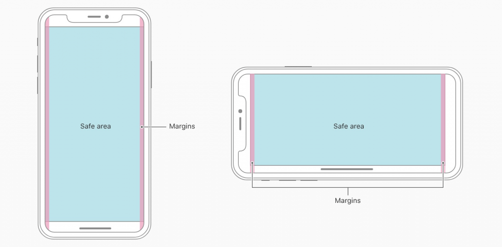
也就是说,我们要做好适配,必须保证页面可视、可操作区域是在安全区域内。
更详细说明,参考文档:Human Interface Guidelines – iPhoneX
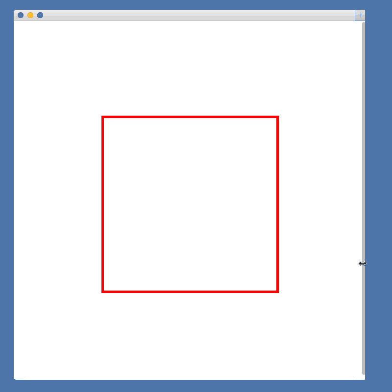
viewport-fit
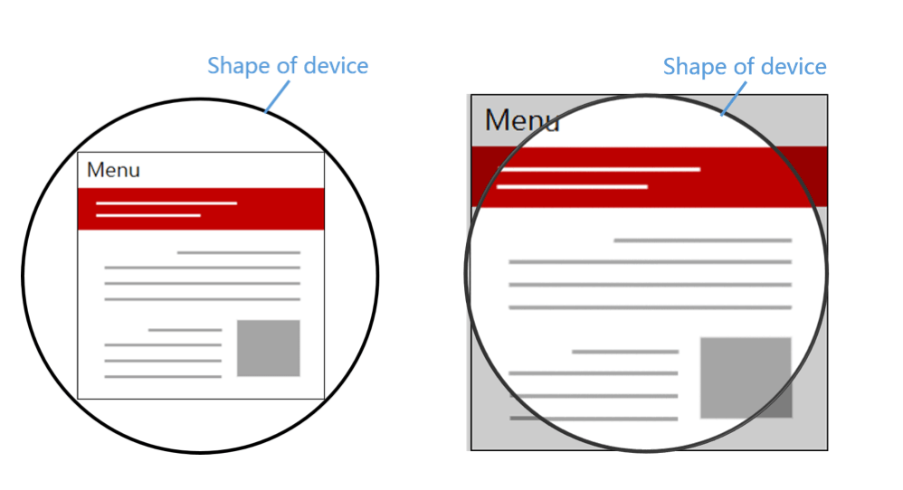
iOS11 新增特性,苹果公司为了适配 iPhoneX 对现有 viewport meta 标签的一个扩展,用于设置网页在可视窗口的布局方式,可设置三个值:
- contain: 可视窗口完全包含网页内容(左图)
- cover:网页内容完全覆盖可视窗口(右图)
- auto:默认值,跟 contain 表现一致
注意:网页默认不添加扩展的表现是 viewport-fit=contain,需要适配 iPhoneX 必须设置 viewport-fit=cover,这是适配的关键步骤。
更详细说明,参考文档:viewport-fit-descriptor
env() 和 constant()
iOS11 新增特性,Webkit 的一个 CSS 函数,用于设定安全区域与边界的距离,有四个预定义的变量:
- safe-area-inset-left:安全区域距离左边边界距离
- safe-area-inset-right:安全区域距离右边边界距离
- safe-area-inset-top:安全区域距离顶部边界距离
- safe-area-inset-bottom:安全区域距离底部边界距离
这里我们只需要关注 safe-area-inset-bottom 这个变量,因为它对应的就是小黑条的高度(横竖屏时值不一样)。
注意:当 viewport-fit=contain 时 env() 是不起作用的,必须要配合 viewport-fit=cover 使用。对于不支持env() 的浏览器,浏览器将会忽略它。
在这之前,笔者使用的是 constant(),后来,官方文档加了这么一段注释(坑):
The env() function shipped in iOS 11 with the name constant(). Beginning with Safari Technology Preview 41 and the iOS 11.2 beta, constant() has been removed and replaced with env(). You can use the CSS fallback mechanism to support both versions, if necessary, but should prefer env() going forward.
这就意味着,之前使用的 constant() 在 iOS11.2 之后就不能使用的,但我们还是需要做向后兼容,像这样:
padding-bottom: constant(safe-area-inset-bottom); /* 兼容 iOS < 11.2 */
padding-bottom: env(safe-area-inset-bottom); /* 兼容 iOS >= 11.2 */
注意:env() 跟 constant() 需要同时存在,而且顺序不能换。
更详细说明,参考文档:Designing Websites for iPhone X
如何适配
了解了以上所说的几个知识点,接下来我们适配的思路就很清晰了。
第一步:设置网页在可视窗口的布局方式
新增 viweport-fit 属性,使得页面内容完全覆盖整个窗口:
<meta name="viewport" content="width=device-width, viewport-fit=cover">
前面也有提到过,只有设置了 viewport-fit=cover,才能使用 env()。
第二步:页面主体内容限定在安全区域内
这一步根据实际页面场景选择,如果不设置这个值,可能存在小黑条遮挡页面最底部内容的情况。
body {
  padding-bottom: constant(safe-area-inset-bottom);
  padding-bottom: env(safe-area-inset-bottom);
}
第三步:fixed 元素的适配
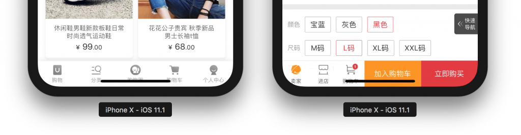
类型一:fixed 完全吸底元素(bottom = 0),比如下图这两种情况:
可以通过加内边距 padding 扩展高度:
{
  padding-bottom: constant(safe-area-inset-bottom);
  padding-bottom: env(safe-area-inset-bottom);
}
或者通过计算函数 calc 覆盖原来高度:
{
  height: calc(60px(假设值) + constant(safe-area-inset-bottom));
  height: calc(60px(假设值) + env(safe-area-inset-bottom));
}
注意,这个方案需要吸底条必须是有背景色的,因为扩展的部分背景是跟随外容器的,否则出现镂空情况。
还有一种方案就是,可以通过新增一个新的元素(空的颜色块,主要用于小黑条高度的占位),然后吸底元素可以不改变高度只需要调整位置,像这样:
{
  margin-bottom: constant(safe-area-inset-bottom);
  margin-bottom: env(safe-area-inset-bottom);
}
空的颜色块:
{
  position: fixed;
  bottom: 0;
  width: 100%;
  height: constant(safe-area-inset-bottom);
  height: env(safe-area-inset-bottom);
  background-color: #fff;
}
类型二:fixed 非完全吸底元素(bottom ≠ 0),比如 “返回顶部”、“侧边广告” 等
像这种只是位置需要对应向上调整,可以仅通过外边距 margin 来处理:
{
  margin-bottom: constant(safe-area-inset-bottom);
  margin-bottom: env(safe-area-inset-bottom);
}
或者,你也可以通过计算函数 calc 覆盖原来 bottom 值:
{
  bottom: calc(50px(假设值) + constant(safe-area-inset-bottom));
  bottom: calc(50px(假设值) + env(safe-area-inset-bottom));
}
你也可以使用 @supports 隔离兼容样式
写到这里,我们常见的两种类型的 fixed 元素适配方案已经了解了吧。如果我们只希望 iPhoneX 才需要新增适配样式,我们可以配合 @supports 来隔离兼容样式,当然这个处理对页面展示实际不会有任何影响:
@supports (bottom: constant(safe-area-inset-bottom)) or (bottom: env(safe-area-inset-bottom)) {
  div {
    margin-bottom: constant(safe-area-inset-bottom);
    margin-bottom: env(safe-area-inset-bottom);
  }
}
写在最后
以上几种方案仅供参考,笔者认为,现阶段适配处理起来是有点折腾,但是至少能解决,具体需要根据页面实际场景,在不影响用户体验与操作的大前提下不断尝试与探索,才能更完美的适配。
感谢您的阅读,本文由 凹凸实验室 版权所有。如若转载,请注明出处:凹凸实验室(https://aotu.io/notes/2017/11/27/iphonex/)


